What is a Landing Page? Definitions, Uses, and Best Practices
Discover what a landing page is, and how to leverage it for maximum SEO and conversion impact. Explore eight best landing page examples from Dropbox to Canva, revealing the secrets behind their success and landing page best practices to guide your strategy.
Have you ever wondered what a landing page is and why it’s a big deal in online marketing? Then you’ve landed in the right place. Landing pages are one of the best online marketing strategies to turn visitors into leads and customers. They are designed with specific goal in mind - to get your visitors to take action, such as signing up or making a purchase.
Landing pages solely focus on converting visitors into customers by giving them a smooth experience on the page and guiding them towards making a decision without any distractions. So, you may ask how do you use landing pages to drive conversions? In this guide, you will see some real-world examples that showcase how effective landing pages can be. Are you ready to boost your online marketing and leave your competitors behind? Let’s dive into the world of landing pages to see the magic happen!
A landing page is a standalone web page that is different from your main website, which is created for a specific purpose. It is the destination where visitor lands after clicking on emails or ads from platforms like Google, Bing, YouTube, etc.
Unlike generic websites which enable you to explore, landing pages are designed to persuade you to take a single action, known as call-to-action (CTA). This targeted approach makes it highly effective to convert visitors into leads or customers by directing them towards making a decision like subscribing to a newsletter, registering for a webinar, or purchasing a product.
Definitions: The Landing Page Essentials
To gain a better understanding, it’s important to be familiar with the key components of a landing page:
Headline: A compelling and clear statement that grabs the visitor’s attention and explains the value proposition.
Subheadline: In addition to what the headline explains, it provides further information about it to the visitors.
Call-to-Action (CTA): A button or link enabling the visitor to take a desired action.
Lead Capture Form: A form that collects visitor information in exchange for the value offered.
Images or Videos: Visual elements that describe the message or offer.
Benefits and Features: Bullet points or sections detailing what you offer and why it’s valuable.
Testimonials or Social Proof: Builds trust by showcasing the experiences of other users who have used your products or services.
Best Practices for Landing Pages: The Secret Sauce
Creating an effective landing page is more than just adding features and benefits of your offer.
Here are the landing page best practices that can significantly improve its performance:
Clarity and Simplicity: Have a clear message and simple layout to direct visitors’ attention to the call-to-action (CTA).
Targeted Messaging: Customize the content to meet the expectations of incoming traffic, whether from a specific ad campaign, search keyword, or demographic.
Compelling Value Proposition: Emphasize what sets your offer apart and why it matters to your audience.
Testing and Optimization: Conduct A/B test to experiment with different elements such as headlines, CTAs, and images to determine the most effective approach.
Mobile Optimization: Ensure the page is visually appealing and functions seamlessly on mobile devices, as a significant portion of web traffic comes from mobile users.
Fast Loading Times: Optimize page load speed to minimize bounce rates and enhance user experience.
Trust Signals: Add testimonials, security badges, or press mentions to establish credibility and build trust with visitors.
Homepage vs. Landing Page
Understanding the difference between a homepage and a landing page is important for optimizing for conversions and enhancing user engagement. While both serve a crucial role in guiding visitors through a website, they have distinct purposes and functionalities tailored to specific marketing objectives.
A homepage is the main entry point to a website that provides visitors with an overview of the business, its offerings, and navigates to other sections of the website. It usually contains several call to actions (CTAs) and encourages visitors to explore blogs, products, or services. The content on a homepage is usually broad and aims to introduce the business to visitors.
On the other hand, a landing page is a solo page with a specific focus on driving conversions. Unlike homepages, landing pages are designed to entice visitors to take a specific action, such as making a purchase, downloading a resource, or filling out a form. They usually have a single, targeted CTA aimed at driving the desired action. Landing pages are highly focused to capture the visitor’s attention and persuade them to convert.
Types of Landing Pages
There are several types of landing pages that serve specific roles in amplifying conversions:
Lead Generation Landing Pages
Lead generation landing pages are designed to capture visitor information, such as names, email, or phone numbers, in exchange for a valuable resource, such as an eBook, whitepaper, or webinar. These pages typically have a lead form and a compelling headline that describes the benefits of the offer.

The primary goal of the lead generation landing pages is to generate sales leads by encouraging visitors to share their details through a form in order to access the content offered. This type of landing page helps in lead nurturing where you can deliver relevant content and offers to potential customers over time, ultimately nurturing their interest and guiding them through the customer journey.
Single-Offer Landing Pages
Single-offer landing pages, as the name mentions, are focused on promoting a single offer or asset. They are highly effective in driving conversions in the later stages of the customer journey when addressing the pain points. These landing pages highlight a single product, service, or offer, providing detailed information and compelling reasons for the visitor to take action.

Click-Through Landing Pages
Click-through landing pages are designed to direct prospects towards a subscription or direct sale. They are effective for high-volume sales and immediate conversions. These landing pages feature clear and compelling headlines, persuasive copy, and a prominent call-to-action (CTA) button, such as “sign up” or “buy now”.

Click-through landing pages are commonly used by ecommerce sites to drive high-volume sales quickly. They are aimed to prompt visitors to take instant action, leading them to a transaction page to complete a purchase or subscription.
Make your
meetings matter
Loved and trusted by 100,000+ users:
- Automatically Record and Transcribe Meetings
- Extremely Accurate Notes, Summaries, and Action Items powered by AI
- Works with Zoom, Google Meet, and Microsoft Teams
- Save time and follow-up with quick async videos
Simply connect your work Google or Microsoft Calendar to get started.
To describe the effectiveness of landing pages in action, let's look at some notable examples from the industry leaders like Slack, Hubspot, Dropbox, Squarespace, Wix, Zoom, Mailchimp and Canva.
If you're interested in any of these tools, make sure you check out the NachoNacho SaaS discount marketplace, where you'll find deals for HubSpot, Slack, Squarespace, and hundreds more of up to 30%!
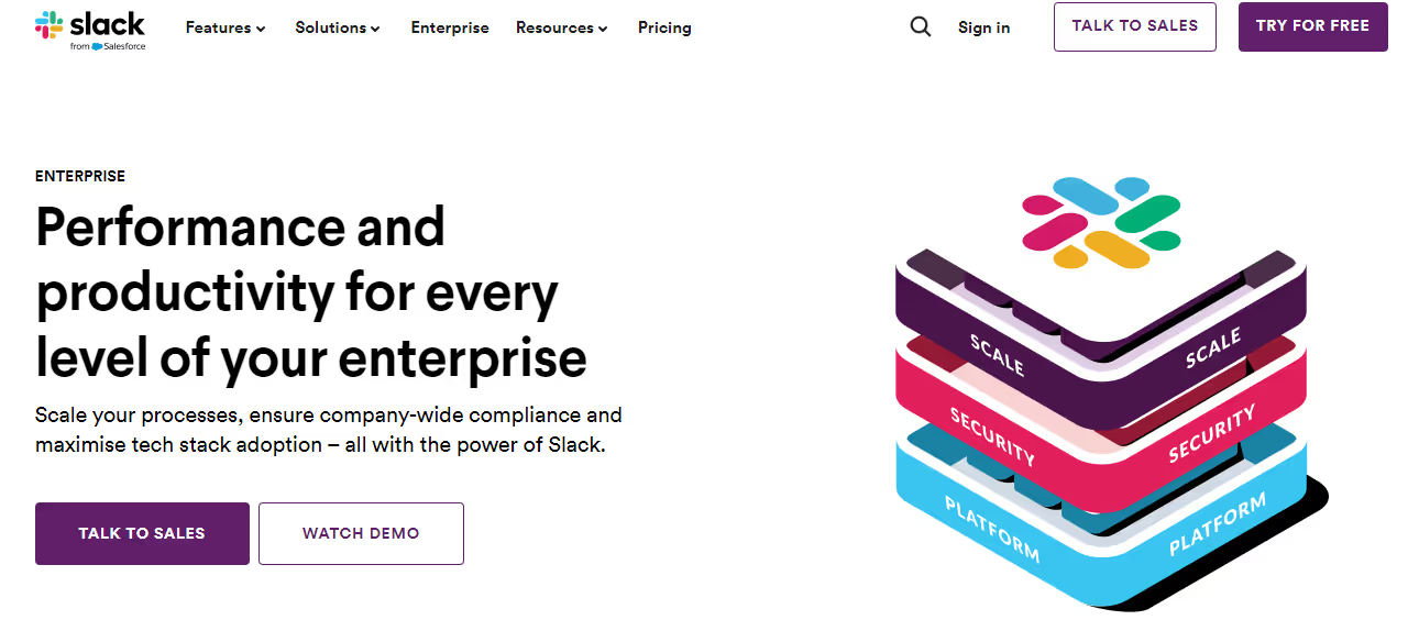
Slack’s Enterprise landing page showcases dynamic visuals and interactive elements to captivate users, transforming the lead generation process into an informative and enjoyable experience. The primary objective of the landing page is to introduce Slack’s messaging platform to potential customers and enable them to use Slack for team communication.
The messaging focuses on how Slack can enhance collaboration, productivity, and transparency in the workplace by highlighting features such as file sharing, organized conversations, seamless integration, and more.
The layout of the landing page is clean, and spacious, with ample whitespace. Key sections include a hero image, key features, customer stories, integrations, and a call-to-action. Additionally, the customer logos are used to build credibility and trust with the visitors. The main goal of Slack's landing page here is to generate leads and prompt visitors to start using the platform.

The HubSpot Free CRM landing page is one of the best examples of providing upfront value. By showcasing its array of tools and resources, HubSpot effectively demonstrates how landing pages can be utilized for lead capture while simultaneously delivering instant value.
The main purpose of the HubSpot’s CRM landing page is to introduce and promote the CRM solutions to potential customers who are searching for CRM options. The key messages on the page focus on highlighting that HubSpot CRM is free, helps businesses organize, track, and grow their customer relationships.
The layout of the page is designed to be simple, clean, and spacious, with key sections including the main product introduction, key features, customer testimonials, FAQs, and a prominent call-to-action. The use of white space and strategic placement of content and images contribute to an engaging user experience.
The primary conversion goal is to encourage visitors to sign up for a free trial of HubSpot CRM directly on the page. Secondary goals include encouraging visitors to watch demo videos, read customer stories, or contact sales.
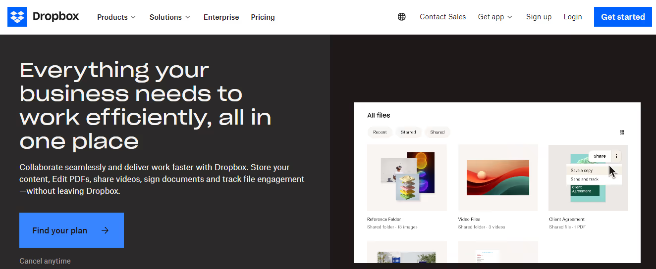
Dropbox’s business landing page shows minimalistic design principles. It has a clean and uncluttered layout and effectively communicates its value proposition.
The primary purpose of the landing page is to promote Dropbox Business to potential business customers who are seeking secure file storage and collaboration tools. The key messages emphasize features like seamless file syncing, sharing, search, integrations, administrative controls, security, and support.
The layout of the landing page is simple, with clear key features, plans and pricing, customer testimonials, FAQs, and a signup call-to-action (CTA). This layout aims to provide an informative and engaging user experience.
Images like screenshots, illustrations, and customer logos are employed to showcase Dropbox features, build trust in the brand, and enhance the visual appeal of the presentation.The main goal of this landing page is to drive businesses to sign up for a free trial of Dropbox Business.

Squarespace’s Enterprise landing page empowers enterprises with its appealing design templates. The main purpose of the landing page is to introduce Squarespace’s all-in-one platform to large businesses looking for an easy website builder for building websites and online stores.
The key message directly addresses the needs and pain points of the target audience (large businesses/organizations) and highlights how Squarespace allows fast and simple creation of beautiful SEO websites with the help of powerful ecommerce features.
The layout of the landing page is clean & uncluttered with enough white space and separate sections for key features, templates, examples, and a contact form. Attractive images and videos are used to showcase various website designs and templates available on Squarespace. The main goal of the Squarespace’s Enterprise landing page is to generate leads from interested enterprises, making it an effective lead generation tool.
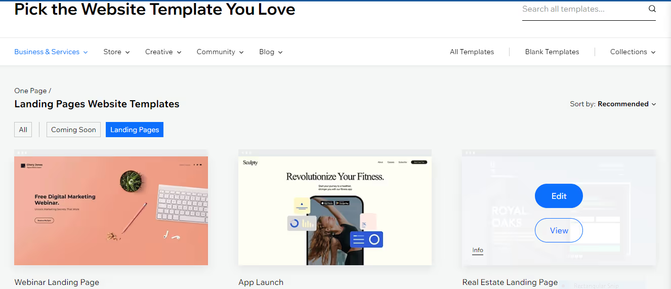
Wix’s landing page emphasizes personalization and direct engagement. The interactive elements invite users to start creating instantly, showcasing the platform’s ease of use and customization capabilities. The primary purpose of the landing page is to encourage visitors to sign-up for Wix and use their templates to create a landing page.
The layout features a search bar and template images with brief explanations, allowing visitors to browse through the available templates. The content is arranged into various sections categorizing templates by industry such as restaurant, eCommerce, etc., with descriptions highlighting key features. Wix mainly showcases the variety and quality of their professionally designed landing page templates for different needs.

Zoom’s landing page is designed for quick conversion. The layout is designed to eliminate any confusion, allowing users to sign up instantly. The main purpose of the landing page is to encourage visitors to sign-up for a free or paid Zoom account based on their needs.
The key message emphasizes how Zoom facilitates smooth video conferencing across any device, and highlights features such as one-click meetings, voice commands, cloud recording, and more. The layout of the landing page has clear pricing tiers, key features for each tier, and a call-to-action.
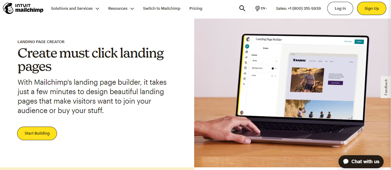
Mailchimp’s landing page has clear, engaging visuals and a short copy. It is strategically designed to entice visitors to use Mailchimp’s landing page builder to create high-converting landing pages.
The layout has a clean design with a clear headline, a feature list, example templates, and call-to-action (CTA) button. The content is crisp, highlighting Mailchimp’s easy drag-and drop builder, along with a list of templates, integrations with email campaigns, analytics, and team collaboration features.
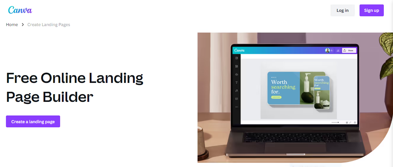
Canva’s landing page uses educational content as a marketing tool. By providing valuable tutorials, Canva engages users in a learning experience and encourages them to take advantage of the platform for their design needs.The layout of the landing page is clean with large template preview images, brief descriptions, and clear call-to-action (CTA) buttons.
The content describes each template’s design style and ideal use case, focusing on the variety of options available.The platform has easy drag-and-drop editing, image library, and collaboration features, along with templates tailored for different industries.
Driving Landing Page Success with Bubbles
It is important to remember that effective online marketing thrives on teamwork and communication. That’s where Bubbles comes into picture. It's not just another collaboration tool, it's a game changer for your team.
With Bubbles, you can share your thoughts whenever inspiration strikes, and an AI notetaker captures every detail. Live meetings become transcripts, action items, and summaries that you can revisit at your convenience while boosting productivity.
Whether you are refining the call-to-action on your landing page or brainstorming the next marketing initiative, Bubbles brings clarity and simplicity to your team’s communication. Say goodbye to misunderstandings and welcome an efficient way to convey your thoughts. Explore Bubbles and see how asynchronous video collaboration can enhance your landing pages.
Collaborate better with your team
Get your point across using screen, video, and audio messages. Bubbles is free, and offers unlimited recordings with a click of a button.
.avif)
Collaborate better with your team
Get your point across using screen, video, and audio messages. Bubbles is free, and offers unlimited recordings with a click of a button.
.avif)





.avif)