
The Ultimate Guide to Web Design for Small Businesses in 2024
Unlock the secrets of successful web design for small businesses with our Ultimate Guide for 2024. Discover eight transformative examples, from Dropbox's simplicity to Slack's engagement mastery, that will inspire your website's call-to-action and elevate your online presence. Transform your small business with web designs that capture attention and convert visitors into loyal customers.
Welcome to "The Ultimate Guide to Web Design for Small Businesses in 2024," where we delve into the digital strategies that set successful small businesses apart. In an era where your online presence is your storefront, mastering the art of web design is not just an option—it's a necessity. This guide is your roadmap to creating a website that not only looks good but also drives engagement, boosts conversions, and elevates your brand in the crowded digital marketplace.
Why Web Design Matters for Small Businesses
Discover why a well-crafted website is crucial for your small business's success. From first impressions to final conversions, learn how the elements of web design play a pivotal role in your customer's journey.
Key Elements of Successful Web Design
Unpack the core components that make a website effective. We'll explore everything from layout and color schemes to navigation and mobile responsiveness, providing you with the tools you need to create a compelling online presence.
8 Inspiring Web Design Examples
Be inspired by eight standout web design examples from leading brands. Each case study showcases innovative ways to engage visitors and guide them toward taking action, offering valuable lessons for small business owners.
Embark on this journey with us as we explore the fundamentals of web design tailored for small businesses. Whether you're building from scratch or looking to refresh your existing site, this guide offers the insights and inspiration you need to succeed in 2024.
1. Dropbox Call-to-Action: A Masterclass in Simplicity
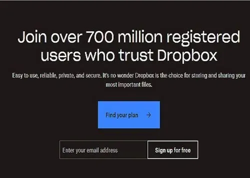
When you land on Dropbox's homepage, you're greeted with a vibe that's as chill as a cucumber but as pointed as a well-aimed dart. It's like Dropbox has read your mind and knows exactly why you're there – and they waste no time with fluff.
Take their "Find your plan" button. This little blue beauty is like a beacon on a dark night, standing out against a sleek, no-nonsense background. It's not just the color that pops; it's the promise of simplicity in a world that's as complicated as Grandma's spaghetti recipe.
Why does this matter for your small biz? Well, Dropbox isn't just throwing paint on a canvas and calling it art; they're strategic. They know that a clear, concise CTA can be the difference between a new customer and a missed opportunity. And let's face it, who isn't looking to snag more opportunities?
In the grand tapestry of web design, it's this minimalistic approach that can speak volumes. You don't need the bells and whistles when a simple, harmonious design can guide your users right where you want them. And where you want them, is clicking that CTA like there's no tomorrow.
So, as you're crafting your site, think about what Dropbox has done. They've taken the K.I.S.S. approach (Keep It Super Simple, folks) and turned it into a masterclass on web design efficiency. Let's take that lesson to heart and make your web design as straightforward as a bee-line – with a CTA that's as clear as a sunny day.
2. Warby Parker Home Try-On CTA: Personalized Engagement

Ever landed on a page and felt like you just walked into a party where everyone wants to know your name? That's Warby Parker's Home Try-On page for you. They're not just selling glasses; they're offering you a seat at the cool kids' table.
Their CTA buttons, "Browse Women" and "Browse Men," are like that friend who says, "Hey, let's go on an adventure," but you actually end up having a blast. No fuss, no confusion — just two clear choices that make you think, "Yeah, I do want to see what I'd look like in those frames!"
Why's this a big deal? Because in the land of "web design for small businesses," clarity is king, and Warby Parker's wearing the crown. They break down their Home Try-On process with the ease of a Sunday morning, making sure you know exactly what you're in for — a stroll through their best frames, on the house.
This, my friends, is the digital equivalent of a warm welcome mat. It shows that good design isn't just about looking snazzy; it's about creating a smooth path from "Just looking, thanks" to "I'll take those in tortoiseshell, please!"
So, small business owners, let's take a leaf out of Warby Parker's book. Serve up your web visitors with clear choices and a path so well-marked, they could walk it blindfolded. Because when your CTAs are as clear as a cloudless sky, your customers will follow them all the way to the checkout. And that's just good business.
3. Mailchimp CTA: Simplifying Email Marketing
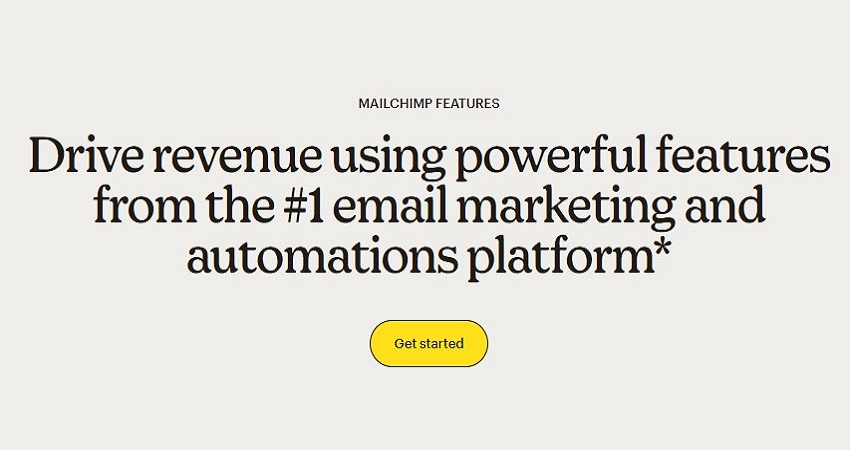
Hop onto Mailchimp’s features page, and bam! You’re not just hit with a wall of text; you’re greeted with a yellow-buttoned invitation to start your journey. And it’s not just any invite; it’s the golden ticket to the email marketing chocolate factory.
"Drive revenue using powerful features from the #1 email marketing and automations platform" – that’s not just a statement; it's a promise, and the "Get started" button is your RSVP to the party. It’s not shy, it’s not retiring — it’s as bold as your Aunt Mabel's lipstick at a family reunion.
Why does this work? Because Mailchimp knows the secret sauce of web design for small businesses: Make the next step clearer than your grandma's spectacles. No hidden doors, no treasure maps needed; just a big, bold button that says, “Hey, let’s do this.”
And let's be real — in the digital tango of user experience, Mailchimp is doing the lead. They take complex info and make it as digestible as your morning cornflakes. The result? A CTA that’s not just seen; it’s acted upon.
In the end, it’s all about getting those mouse pointers to click with purpose. So, when you're brewing your own web concoction, stir in a spoonful of Mailchimp’s clarity. Because when your CTAs are as clear as a summer's day, your customers won’t just visit; they’ll stick around.
4. Squarespace Template CTA: Empowering Creativity

Squarespace is like that cool, artsy friend who makes everything look effortless. You know, the one who can throw together an impromptu gallery wall and suddenly it's #InteriorDesignGoals?
Their "Build your own template" button is a masterclass in simplicity. It's like they're saying, "Hey, you got this. And we've got your back." No clutter, no fuss, just a straight shot to making your website dreams a pixel reality.
Why's this a winner? Because in the busy bazaar that is the internet, Squarespace's clean layout is a breath of fresh, minimalist air. It’s the digital zen garden where your creative chaos can find order.
So, if you’re crafting a web design for your small biz, take a leaf out of Squarespace’s book. They're not just selling templates; they're selling a vision of what could be. Your site should be a launchpad for your visitors' aspirations, too.
And that button isn't just a button; it's a starting block for the race to online greatness. It stands out not because it's loud, but because it's clear. Like a lighthouse guiding ships home, it guides users to take action.
Remember, when you’re speaking to the world through your website, sometimes less is more. And Squarespace? They're the minimalist maestros. So go ahead, hit that CTA, and let's start painting the Internet with your brand colors.
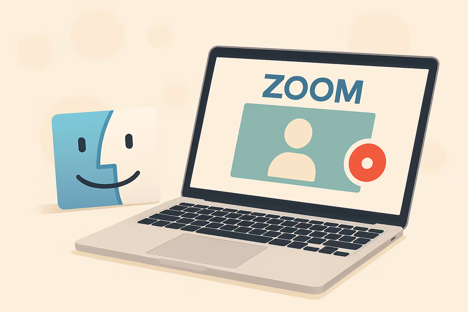
Make your
meetings matter
Loved and trusted by 100,000+ users:
- Automatically Record and Transcribe Meetings
- Extremely Accurate Notes, Summaries, and Action Items powered by AI
- Works with Zoom, Google Meet, and Microsoft Teams
- Save time and follow-up with quick async videos
Simply connect your work Google or Microsoft Calendar to get started.

5. Casper Mattress Selection: Designing for Decision Making

Slide into Casper's website, and it's like stepping into a dreamland where every mattress whispers, "Sleep here, friend." Their product detail page? A masterclass in how to present your wares without sending your visitors to snoozeville.
Those "Explore [Mattress Name]" buttons aren't just there for show. They're like friendly hotel staff, inviting you to take a closer look at what a night’s stay could be like. And with their cool blue hue, they're hard to miss, like a pool in a desert.
But it's not just about being seen; it's about the feels. Casper’s got this game on lock. They combine those crisp images with star ratings and prices that have been slashed—just enough to make you feel like you're saving big before you've even clicked.
Here's the kicker: This isn't about mattresses; it's about the journey to find 'the one.' And that’s something every small business web page needs to nail. It's not just selling a product; it's selling a golden ticket to a better experience.
So, dear reader, as you spin the web of your own digital storefront, remember Casper's cozy corner of the internet. Make your CTAs as inviting as a warm bed on a cold night, and watch as your customers tuck themselves into your sales funnel.
6. Zendesk Free Trial CTA: Inviting Customer Engagement

Zendesk’s page isn’t just a page; it’s like the digital equivalent of a warm handshake or a cozy coffee shop chat. Their “Start your free trial” button is a purple splash of welcome on a canvas of opportunity.
And that’s the thing – it's not shouting at you with neon lights. Nope. It's sitting there, cool as a cucumber, saying, “Hey, whenever you’re ready, we're here to show you the ropes. No pressure, just all the good stuff on your terms.”
This approach? It’s a breath of fresh air. It’s like Zendesk is the friend who helps you move house and doesn’t even need to be asked. They just rock up with a smile and a “Where do we start?”
Now, that’s the kind of user-friendly vibe you want to channel. Whether you’re selling artisanal cupcakes or bespoke bow ties, your site needs to roll out the red carpet in a way that says, “Walk this way for top-notch service.”
So, as you spin the web for your small business, keep it Zendesk-chill. Make your CTAs as friendly as a neighbor's dog that’s come to say hello. Because when clicking feels this good, who wouldn’t want to dive in?
7. Etsy Category Highlights: Crafting a Story with Every Click

Stroll through Etsy’s homepage, and it's like wandering through a vibrant market bazaar—each click takes you on a different little adventure. The "Celebrate spring with the freshest finds from small shops" banner? That's your invitation to dive into a world sprinkled with imagination.
With those circle snapshots of 'Personalised Gifts' and 'Home Decor', Etsy's not just nudging you to browse; they're giving you a visual handshake and a "How do you do?" The colors pop, the images beckon, and suddenly you're not just shopping—you're on a treasure hunt.
Why's this cool for you, the small business owner? Because Etsy's whispering a thousand words with just a few images. They're not hard-selling; they're hard-storytelling. And in the business of web design, that's what turns a passerby into a customer.
Take a cue from this e-commerce maestro. Make your CTAs not just buttons to click, but entryways to experiences. Let your website be the map that leads users to the 'X' that marks the spot. And remember, on the internet, X marks the 'buy now' button.
So, as you weave the web of your own site, keep it Etsy-elegant. Let every link be a handshake, every image an invitation. Because when you make shopping feel like the beginning of a story, who wouldn't want to stick around for the ending?
8. Slack's Slick Click: Designing for Effortless Engagement

Jump onto Slack's feature page and there it is: "TRY FOR FREE". It's not just a button; it's like the first step on a journey to cool-town. The design? Cleaner than your grandma's kitchen counter. The message? As clear as the bell that rings at the start of a boxing match.
Slack's rocking the minimalist vibe with a purple punch that says, "Hey, let's get to work, but let's keep it snazzy." And it works. It's not just about getting you to click; it's about making you feel good doing it.
Why's this perfect for your small biz web design? Because Slack is showing us the playbook on how to make a button more than a button—it's the gateway to a better day at work. And let's be honest, who doesn't want that?
So, take a leaf out of Slack’s book. When it comes to your website, don’t just throw CTAs around like last year's confetti. Make 'em count. Make 'em pop. Make 'em an offer your visitors can’t refuse.
Because in the grand digital bazaar, your "TRY FOR FREE" is your virtual handshake. It's your “Nice to meet ya” that can turn into “Where have you been all my life?”
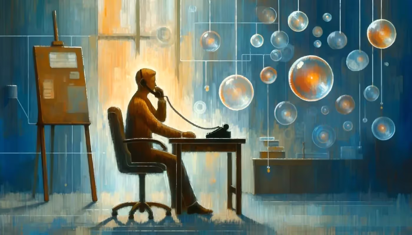
Elevate Your Web Design with Bubbles
As we wrap up our journey through "The Ultimate Guide to Web Design for Small Businesses in 2024," it's clear that the digital landscape is both a challenge and an opportunity for small businesses. But the road to web design mastery doesn't have to be walked alone. Enter Bubbles, your next step towards effortless collaboration in the realm of digital design and beyond.
Bubbles is not just another tool in your arsenal; it's a game-changer for designers, product managers, marketers, and software developers alike. With its asynchronous video collaboration capabilities, Bubbles allows teams to give and share feedback in a dynamic, engaging way. Imagine being able to pinpoint exactly what needs to change on your website and communicate it effectively, without the back-and-forth of traditional meetings.
AI-Powered Insights at Your Fingertips
But that's not all. Bubbles brings an AI notetaker into your meetings to record, transcribe, and create actionable summaries. This means less time spent on note-taking and more time focusing on what matters: making your small business website as impactful as possible. With the ability to follow up asynchronously, your team can keep the momentum going, ensuring that every piece of feedback is addressed and every idea is explored.
Your Partner in Digital Transformation
In the digital age, collaboration is key to staying ahead. Bubbles provides the platform for your team to come together, share insights, and push your web design to new heights. Whether you're refining your call-to-action or reimagining your user experience, Bubbles is there to make the process smoother, faster, and more effective.
Discover how Bubbles can transform your approach to web design and collaboration. Visit our homepage and take the first step towards a more connected, creative, and productive future. Your ultimate web design is just a bubble away.
Collaborate better with your team
Get your point across using screen, video, and audio messages. Bubbles is free, and offers unlimited recordings with a click of a button.
.avif)


Collaborate better with your team
Get your point across using screen, video, and audio messages. Bubbles is free, and offers unlimited recordings with a click of a button.
.avif)