10 Best Practices for Landing Pages: Boost Your Conversion Rate
Discover the top 10 best practices for landing pages to skyrocket your conversion rates, featuring success stories from Dropbox, Slack, Zoom, and more. Learn how to captivate your audience with minimalist design, engaging visuals, concise copy, and clear CTAs. Boost your digital marketing strategy by mastering the art of effective landing page creation.

Your landing page is the front door to your virtual storefront, offering the first impression that either captivates potential customers or turns them away. And with stakes this high, mastering the art of landing page optimization can help your business grow by leaps and bounds. This is your guide to the secrets behind the most successful landing pages on the web, making way for conversion rate optimization.
The Importance of First Impressions
The web is a fast-moving place, and it isn't enough to simply exist online. With lightning speeds and untold amounts of competition, grabbing your audience's attention from the moment they land on your page is key. Your landing page creates an immediate association with the reasoning behind your ad or link and the expected user experience. It is your chance to not only provide an intuitive experience that effortlessly leads visitors to a successful conversion but also an opportunity to make an indelible first connection to the type of brand you are and type of relationship you have to offer.
What Makes a Great Landing Page?
From clear messaging to engaging visuals to strategic calls to action (CTAs), a great landing page operates as a symphony, contacts aligning and harmoniously working together to create something greater than the sum of its parts. Now, let's dive into what makes these components so great in the first place: how you can make sense of all of the pieces at play here to create long-term wins for your landing page. Suffice it to say, you'll want to find what resonates with your customers. But, be cautious not to just blindly copy and swipe — really put thought into each change, while tracking your data.
Join Us as We Dive Deep in Examples
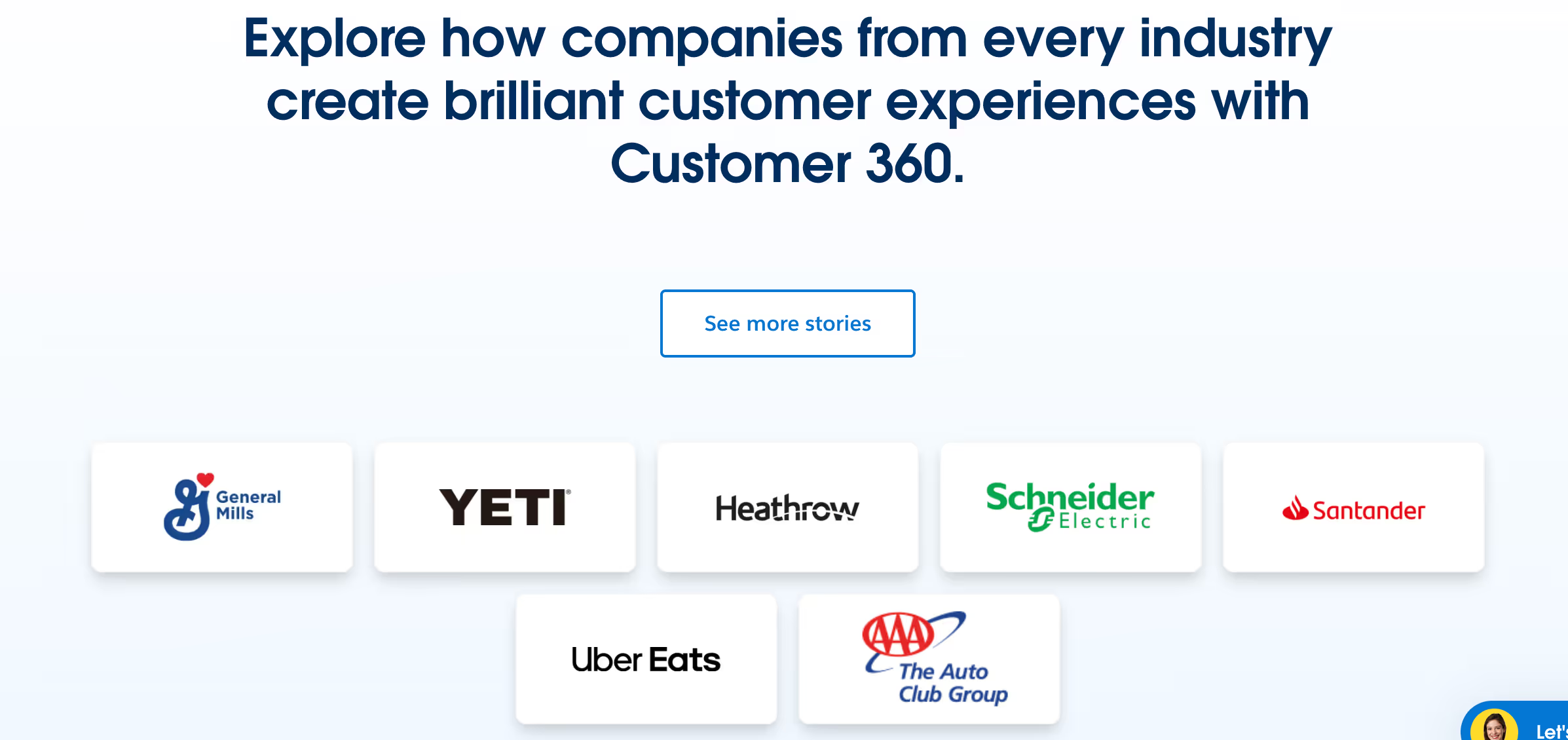
We could write about strategies and best practices all day, but there's nothing like seeing some of these concepts in action! We've analyzed the landing page strategies of some of the hottest companies on the web, including Dropbox, Zoom, Square, Wistia, Mailchimp, Salesforce, Canva, Hubspot, Airbnb, and Slack. We bit the bullet, sat through the webinars (even those that were at and after the 9:00 PM hour), and dug through ad after ad. Most of all, we could (and usually did) reverse-engineer what easily could have been broken down into time-saving procedures to create one of the most helpful resource of any on the web so to speak. Read on for a deep-dive into why these landing page examples are so great, and the things you can take from them to make your own landing page that much better, with a little bit of landing page design magic.
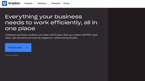
Dropbox's homepage tells you exactly what you're getting; it's a familiar and effective proposition. Requiring low cognitive processing, this sort of design — clear headline and a direct CTA — is the reason why “less is more” is an effective rule in UX design. Dropbox are tapping into the power of focus with their landing page. By cutting away any extraneous ‘stuff,’ they’re able to “guide users’ eyes and help them to see the need for the product” to coin a phrase. This embodies the minimalist design’s ability to boost user decision-making and conversion rates.
For example, imagine a tiny business owner launching an online cour for digital marketing. They could take a leaf from Dropbox’s book, and go for a minimalist landing page that offers the advantages of their course along with a prominent CTA of “Start Learning Now” — reducing the friction to sign-up.
Slack's landing page is a great example of how simplicity and high-quality visuals can combine to create an informative, and inviting user experience. Bright illustrations and concise, powerful copy allow the page to explain the product's features to users without overwhelming them. In any case, the harmony of appealing visuals and bold, clear messaging is crucial to capturing and retaining user interest.
For example, an app developer could use this same law of simplicity and high-quality visuals for a productivity app landing page. With the same bold photography and clean shapes paired with just a few words, a developer could break down the ways their app delivers value to consumers.
Zoom's approach is compelling in the way it minimizes its sign-up form so that only essential details are required. This signifies today's critical balance between user convenience and privacy. By extending such an efficient process, it minimizes barriers to entry, vastly improving the user experience and building trust in the platform, which could translate to huge conversion rate differences.
Imagine a health and wellness platform that is rolling out the ability to consult with professionals via their platform. They might adopt this sign-up process to encourage more individuals to start confidently engaging with their services.
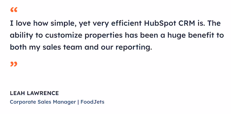
HubSpot leverages customer testimonials effectively to differentiate its offering by boosting its credibility and demonstrating its value. By providing real examples of satisfied customers, prospective customers receive relatable proof about the product's impact, making it easier to trust the company and encouraging them to engage.
For instance, a freelance graphic designer could feature client testimonials and project showcases on their landing page, as well, like HubSpot, to demonstrate their expertise and results, boosting their credibility and bringing in new business.
Not only does Wistia use interactive video demos on their landing page to highlight how their product can help, but they use interactive demos that engage visitors, too, getting them more involved and making their value proposition more memorable. Using interactive elements can make for a much better user experience, leading to more engagement and higher conversions.
A software company with a new product could create a landing page featuring interactive demos of their project management tool that let visitors explore the features of the tool firsthand, helping make its value proposition more vivid and perhaps, generating more interest in the product.
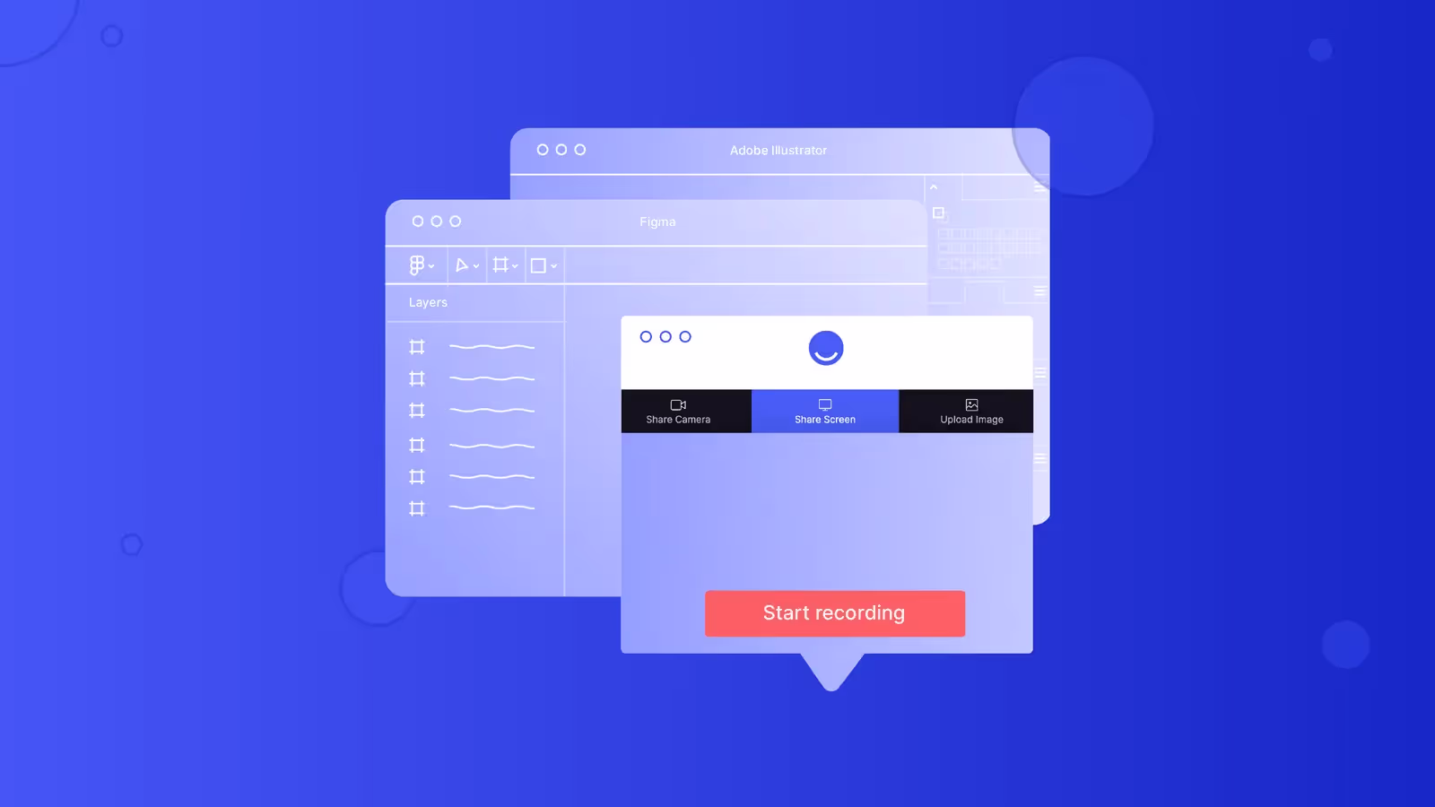
Make your
meetings matter
Loved and trusted by 100,000+ users:
- Automatically Record and Transcribe Meetings
- Extremely Accurate Notes, Summaries, and Action Items powered by AI
- Works with Zoom, Google Meet, and Microsoft Teams
- Save time and follow-up with quick async videos
Simply connect your work Google or Microsoft Calendar to get started.

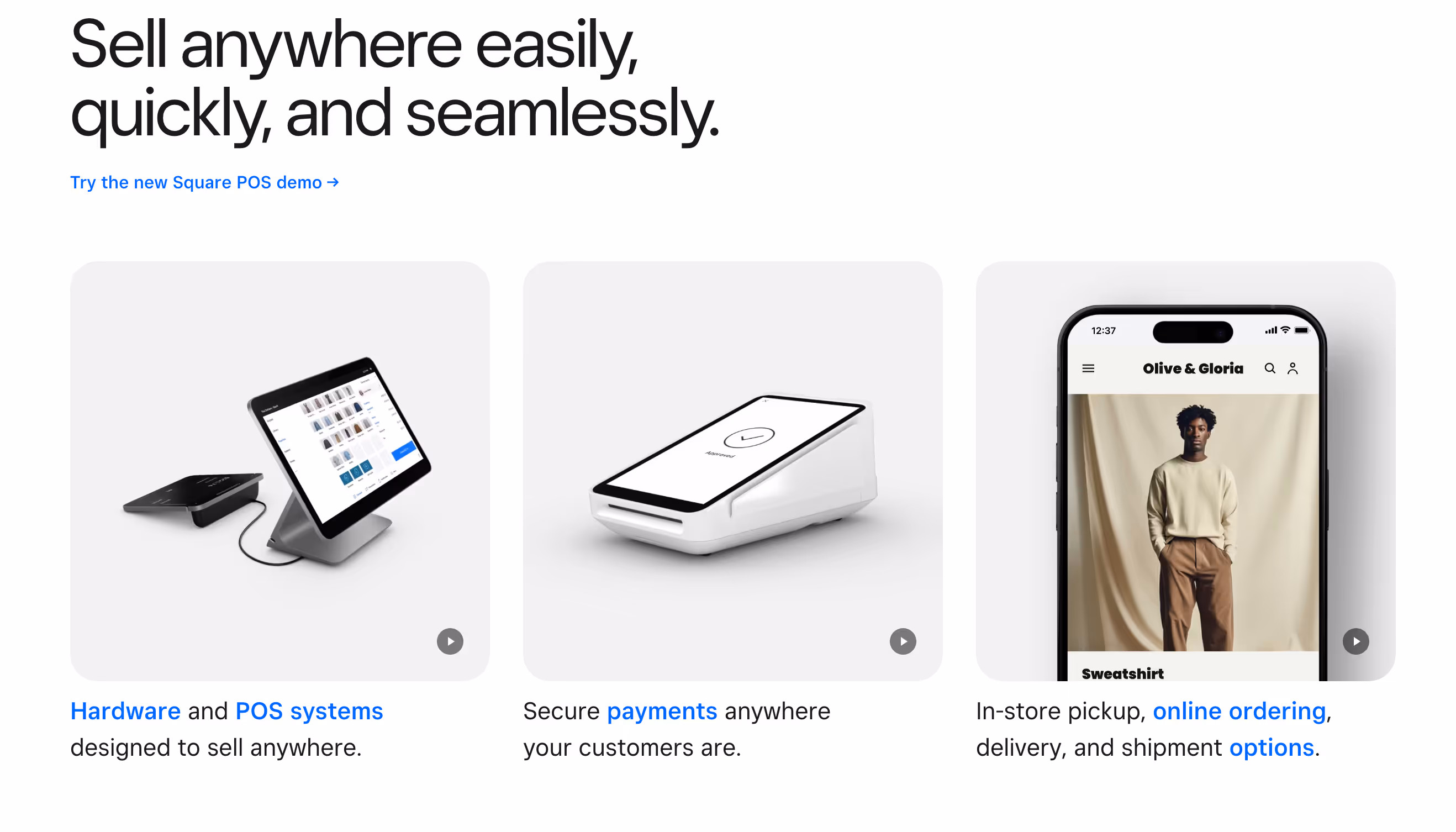
With a fresh feature on the value proposition of the product, clear and detailed visuals and direct copy, Square's landing page nearly sells the reader before they know what the product is. Taking a similar approach could be useful for a cafe promoting an online ordering app, using the product's clear visuals and concise benefits to demonstrate its convenience and encourage early downloads.
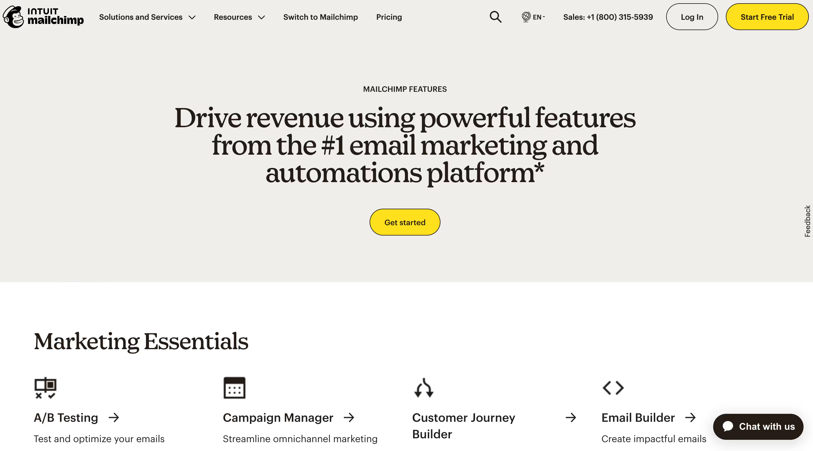
The look of Mailchimp's landing page reminds you more of the functionality of Pinterest than a newsletter service and makes it easy to uncover relevant content thanks to the stylish and intuitive variety of sections. A very easy to navigate landing page can make for a much better user experience, a more enjoyable and value-added one and can further lead to much closer to the customer and a sale.
For instance, an online retailer could create a much more user-friendly landing page, better organize more sections for new arrivals or sales etc., using Mailchimp's homepage design guidelines so it would be easier to shop online and potentially slightly increase conversions.
Salesforce leverages storytelling through customer success stories, showcasing their CRM's real-world impact. In doing so, Salesforce humanizes their brand and reinforces the value of their CRM concisely, creating an emotional connection and fostering trust with their prospects.
For example, a digital marketing agency could use their landing page to share case studies of client success, breaking down specific outcomes like traffic and sales growth, in the style of the Salesforce, to express their service's effectiveness compellingly.
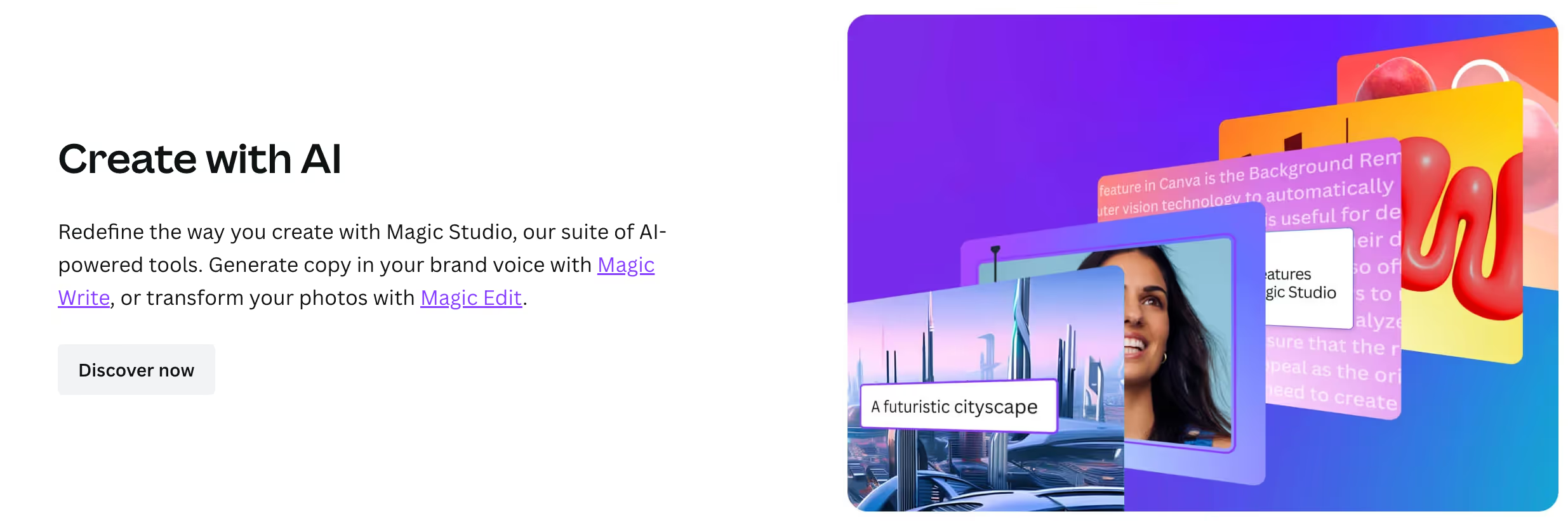
Canva's landing page details the AI-powered tool through a design lens, delivering an interactive experience that displays the tool's grace and might. Centering product features around interaction like this can render the benefit immediate, making conversion more pronounced and likely.
Consider a landing page for a photo editing platform. They could spotlight an AI-powered tool on their landing page, like AI colorization or style transfer, and let users try it live in their photo of choice, as a counterpart to Canva, in order to drive engagement through value.
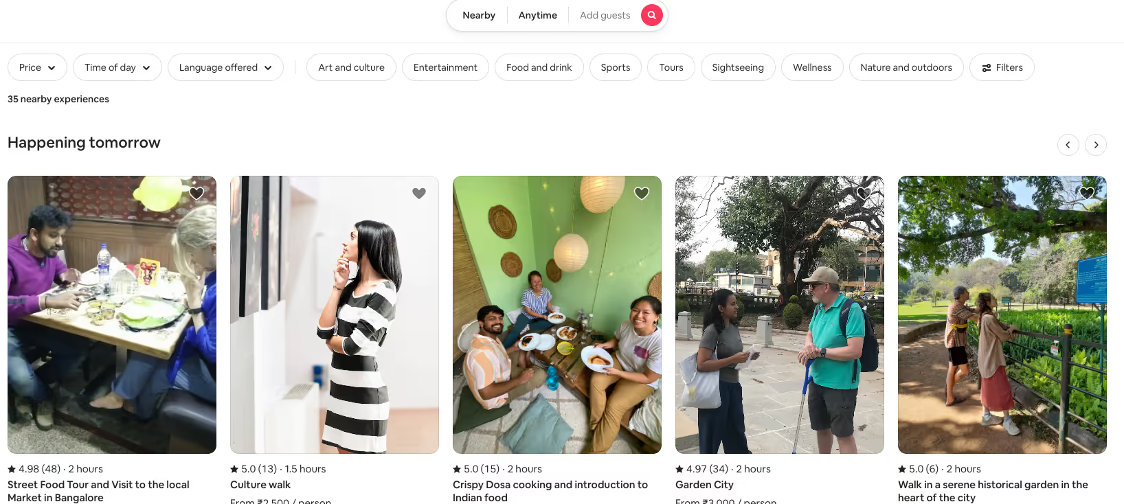
Airbnb's experience hosting page infuses immersive with clear CTAs, together propelling the visitor after the other with imagination on one side, and direction on the other. The fusion of content and CTAs can both inspire and propel, and that power surge from interest into statement is perhaps the biggest potential conversion of them all.
To illustrate, imagine a travel agency stood up with vibrant photography and videography swallowing their landing page, marked with a concise CTAs like "Book Your Adventure," lifting the Airbnb technique to entrance and engage visitors toward concerned tours.
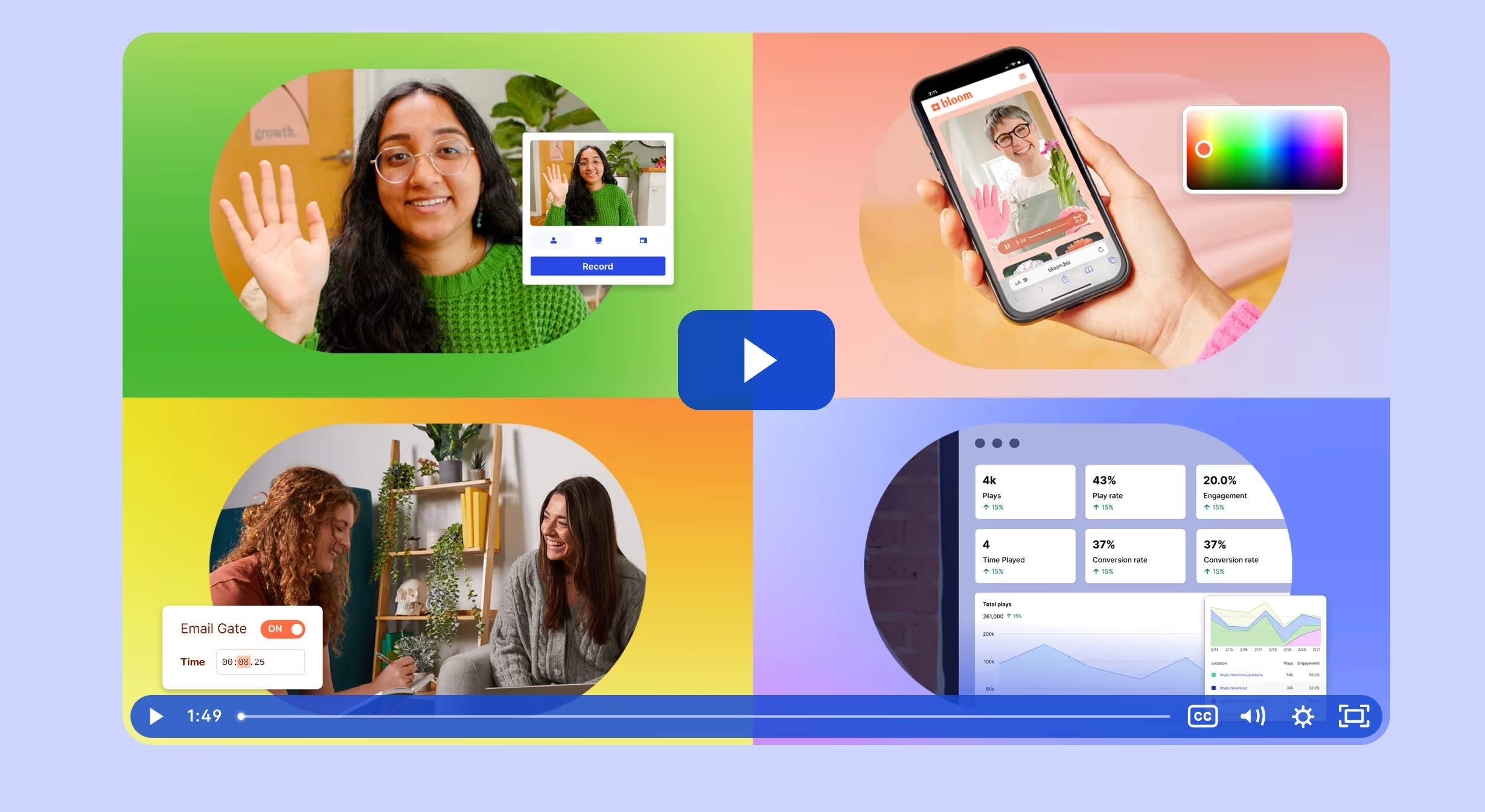
Get Feedback on Your Landing Page with Bubbles
When you empower your team with Bubbles, you turn every landing page into a conversion powerhouse. Aiming to make digital marketing more collaborative, innovative, and not just effective (but wildly successful), we hope you'll join us.
Bubbles also offers asynchronous video collaboration capabilities, AI-driven insights, and easy follow-up features for live meetings.
Collaborate better with your team
Get your point across using screen, video, and audio messages. Bubbles is free, and offers unlimited recordings with a click of a button.
.avif)


Collaborate better with your team
Get your point across using screen, video, and audio messages. Bubbles is free, and offers unlimited recordings with a click of a button.
.avif)